
Many people ask questions like “Should I choose red or blue?” because these two colors are very common in daily life. We see them in clothes, school items, sports teams, logos, signs, apps, and even emotions.
The confusion usually happens because both colors can mean different things in different situations. Sometimes red feels strong and exciting. Other times blue feels calm and peaceful. Some people think one color is better, but the truth depends on the situation.
This article explains the difference between red and blue in very simple English. You will learn what each color usually means, where people use them, and how to choose the right one in daily life.
Quick Answer
Here is the simple answer:
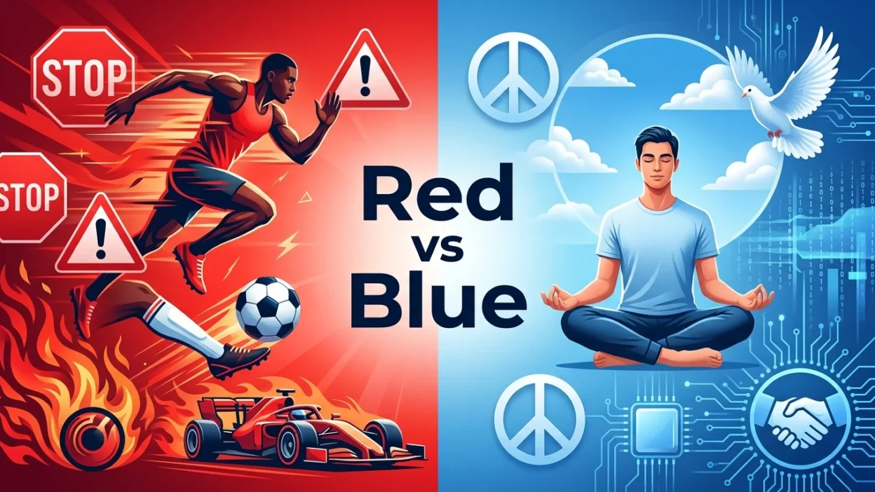
- Red is usually connected with energy, danger, love, excitement, and strong feelings.
- Blue is usually connected with calmness, trust, peace, and relaxation.
- Red gets attention faster.
- Blue feels softer and more comfortable to many people.
- Red is often used when something needs to look powerful.
- Blue is often used when something needs to look safe or professional.
Simple Background of Red and Blue
Colors have been important for thousands of years. People used natural materials to make colors for clothing, art, and decoration.
Red
Red was one of the first colors humans used. It came from clay, plants, and stones. Since blood and fire are red, people often connected red with life, danger, and strong emotions.
Blue
Blue was harder to find in nature for making paint and cloth. Because of this, blue was once rare and special. Over time, people started connecting blue with the sky and the sea, which made it feel calm and peaceful.
Today, both colors are everywhere in modern life.
Main Difference Between Red and Blue
The biggest difference is the feeling each color gives people.
Red Feels Strong
Red usually creates strong emotions. It can make people feel:
- Excited
- Energetic
- Passionate
- Alert
- Hungry
- Angry
Red is bright and easy to notice. That is why stop signs, warning lights, and emergency signals often use red.
Blue Feels Calm
Blue usually creates peaceful emotions. It can make people feel:
- Relaxed
- Safe
- Calm
- Cool
- Trusting
- Comfortable
Blue is softer for the eyes compared to bright red. Many companies use blue because it feels professional and reliable.
Red vs Blue Comparison
| Feature | Red | Blue |
| Main Feeling | Strong and exciting | Calm and peaceful |
| Common Meaning | Love, danger, power | Trust, safety, peace |
| Attention Level | Very high | Medium |
| Temperature Feeling | Warm | Cool |
| Common Uses | Warning signs, sports, sales | Offices, schools, apps |
| Emotional Effect | Active and emotional | Relaxing and stable |
| Best For | Energy and excitement | Calm and trust |
| Popular In | Fashion, sports, alerts | Business, technology |
Which One Should You Use and When?
The best color depends on the purpose.
Use Red When You Want Attention
Red works well when you want something to stand out.
Examples:
- Sale signs
- Emergency buttons
- Sports uniforms
- Romantic gifts
- Food advertisements
Red can make things feel exciting and powerful.
Use Blue When You Want Calmness
Blue works better when you want something peaceful or professional.
Examples:
- School websites
- Office designs
- Banking apps
- Medical logos
- Bedroom decoration
Blue helps people feel comfortable and safe.
Red and Blue in Daily Life
In Clothing
- Red clothes often look bold and confident.
- Blue clothes often look clean and relaxed.
A red jacket may attract attention quickly, while a blue shirt may look calmer and easier to wear every day.
In Sports
Many sports teams use red because it looks energetic and aggressive. Blue is also popular because it looks stable and professional.
In Home Design
- Red rooms may feel warmer and more active.
- Blue rooms may feel cooler and more peaceful.
That is why many bedrooms use blue colors.
In Technology
Many apps and websites use blue because users often trust blue designs more.
Common Mistakes People Make
Thinking One Color Is Always Better
Some people think red is always stronger or blue is always better. This is not true. Both colors are useful in different situations.
Using Too Much Red
Too much red can feel stressful or overwhelming. It may become hard for the eyes after some time.
Thinking Blue Is Boring
Blue can look very modern, smart, and beautiful when used correctly.
Ignoring Culture Differences
Different countries may connect colors with different meanings. In some places, red means luck and happiness. In others, it may mean warning or danger.
Real Life Examples
Emails and Notifications
- Red notifications usually mean something urgent.
- Blue notifications usually feel more normal and calm.
News Channels
Many news companies use blue backgrounds because viewers often connect blue with trust.
Social Media
Some social media apps use blue to make users feel relaxed while using the platform.
Traffic Signals
Red means stop because it catches attention quickly.
Shopping
Stores often use red during sales because people notice it fast.
Red and Blue in Emotions
Colors can affect mood.
Red and Feelings
Red is often linked with:
- Love
- Anger
- Passion
- Energy
People may feel more active around strong red colors.
Blue and Feelings
Blue is often linked with:
- Peace
- Trust
- Sadness
- Relaxation
People may feel calmer around soft blue colors.
Learning Section for Students and Beginners
Here is an easy way to remember the difference.
Simple Memory Trick
- Red = Action
- Blue = Calm
Easy Sentence Examples
Red Examples
- The red light means stop.
- She wore a red dress at the party.
- Red signs are easy to notice.
Blue Examples
- The sky is blue today.
- Blue walls make the room peaceful.
- He likes blue because it feels calm.
Quick Practice
Ask yourself:
- Do I want attention? → Choose red.
- Do I want calmness? → Choose blue.
Red or Blue in Personality Choices
People sometimes choose colors based on personality.
People Who Like Red
They may enjoy:
- Excitement
- Competition
- Fast action
- Strong emotions
People Who Like Blue
They may enjoy:
- Peace
- Stability
- Quiet places
- Careful thinking
This does not mean everyone is the same, but colors can reflect mood and style.
Frequently Asked Questions (FAQ)
Is red stronger than blue?
Red usually feels stronger because it catches attention quickly. Blue feels calmer and softer.
Which color is better for relaxing?
Blue is usually better for relaxation because it feels peaceful.
Why do warning signs use red?
Red is bright and easy to notice fast, so it works well for warnings.
Why do many companies use blue?
Many companies use blue because people often connect it with trust and safety.
Is red a warm color?
Yes. Red is usually called a warm color.
Is blue a cool color?
Yes. Blue is usually called a cool color.
Which color is better for bedrooms?
Many people prefer blue for bedrooms because it feels calm and relaxing.
Can red and blue work together?
Yes. Red and blue can look very good together when balanced properly.
Simple Tips for Choosing Between Red and Blue
Choose Red If:
- You want energy
- You want attention
- You want something bold
- You want excitement
Choose Blue If:
- You want peace
- You want trust
- You want comfort
- You want a professional look
Conclusion
Red and blue are both powerful colors, but they create different feelings.
Red is strong, exciting, and attention grabbing. Blue is calm, peaceful, and trustworthy. Neither color is always better. The right choice depends on the situation and the feeling you want to create.
If you want energy and action, red is often the better choice. If you want calmness and trust, blue is usually the better option.
Understanding these simple differences can help students, beginners, and everyday users make smarter color choices in daily life.